Context
Raw telemetry — accelerometer spikes, speed traces, engine signals — is easy to log and hard to act on. A fleet manager doesn't want a stream of sensor readings; they want to know which drivers are risky and which vehicles need attention before something breaks. This project turns 13,000+ raw telemetry readings across 450 trips for 30 drivers and vehicles into two scores a manager can actually use.
What it does
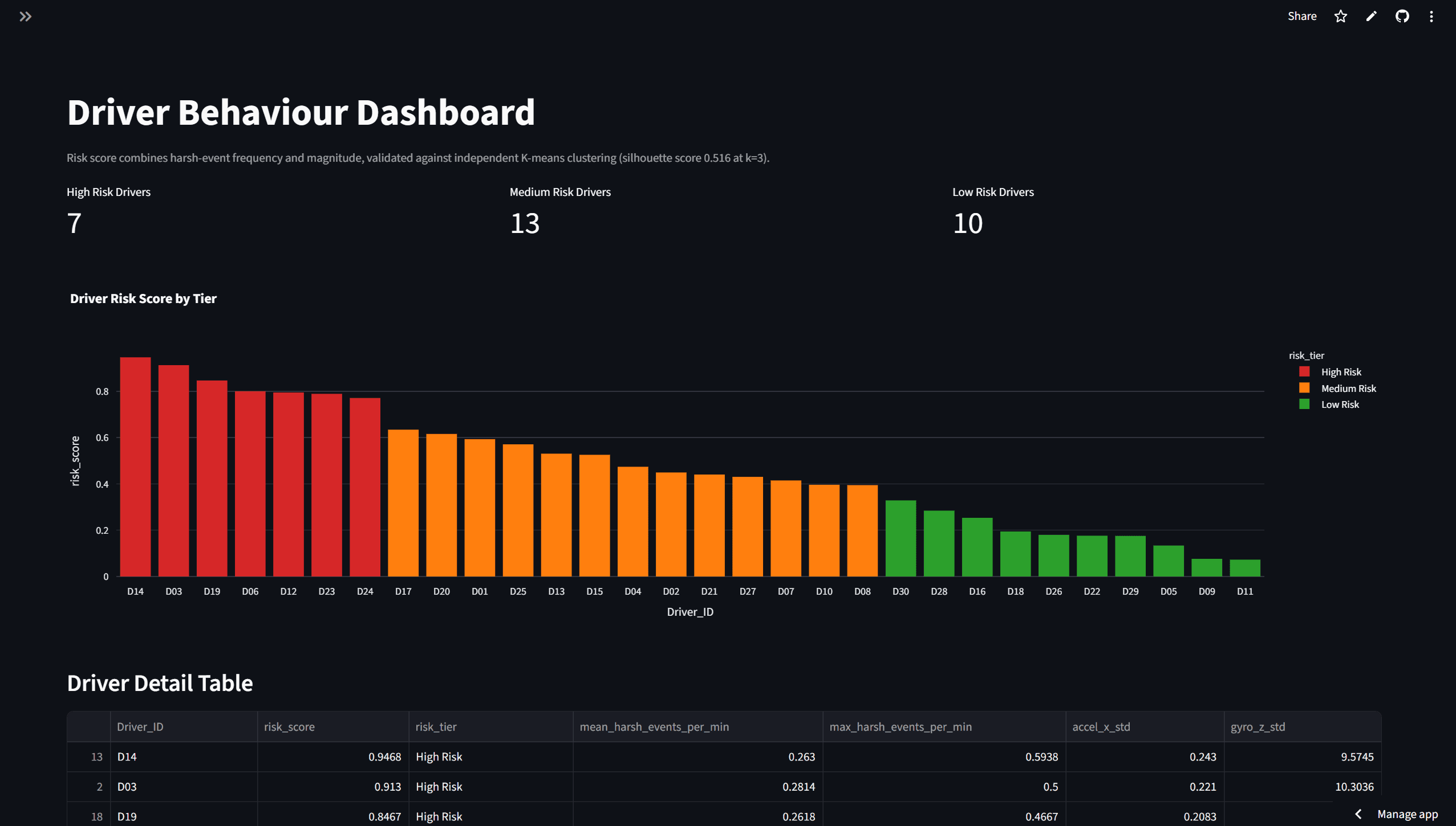
The pipeline flags harsh driving events — hard braking, sharp acceleration, aggressive cornering — using thresholds set statistically at mean plus two standard deviations for each signal, rather than picked by hand. Those events feed into composite driver-risk and vehicle-health scores, which are rendered on a live two-page Streamlit dashboard so a fleet manager can see risk tiers and vehicle condition at a glance.
Architecture
Telemetry readings are loaded and cleaned with Pandas, then Spearman correlation analysis is used to check which signals actually relate to harsh events before those signals are trusted to set thresholds. Harsh-event thresholds are set at mean + 2σ per signal, and rolled up into composite driver-risk and vehicle-health scores. Those scores are cross-checked two independent ways: K-means clustering (silhouette-optimized to k=3, with zero overlap between risk tiers) confirms the risk groups are actually separable, and an Isolation Forest model flags vehicles as anomalous outliers. Everything is served through a two-page Streamlit dashboard built with Plotly.
Key technical decision + tradeoff
Results
- 13,000+
- telemetry readings
- 450 / 30
- trips / drivers-vehicles
- 0 overlap
- cluster separation, k=3
The mean + 2σ thresholds were chosen because Spearman correlation analysis showed they tracked meaningfully with harsh-event signals, rather than being an arbitrary cutoff. Validating the composite risk score against K-means clustering gave a silhouette-optimized k=3 split with zero overlap between tiers, meaning the three risk groups the scoring produces are genuinely distinct in the underlying data, not just an artifact of the scoring formula. The Isolation Forest anomaly detector required a correction after an initial pass mis-flagged vehicles — noted here because it's a real result, not to overstate it as a solved problem.
What's next
The validation set is 30 drivers and vehicles, which is enough to sanity-check that the scoring methodology holds together but small for a production fleet. The next real test would be running this against a larger, live fleet and checking whether the risk tiers still hold up.